The best B2B website designs balance aesthetics with conversion-focused functionality—clear navigation, strategic CTAs, responsive layouts, and social proof. With 75% of prospects judging credibility by website design and 88% never returning after a bad experience, design directly impacts revenue. Top examples include Square for navigation, Asana for CTAs, IBM for responsive design, Dropbox for social proof, and Grammarly for clear value propositions.
Last Refreshed: March 2026 with updated statistics and tool information.
B2B website design is the practice of creating business-to-business websites that balance visual appeal with conversion-focused functionality, including clear navigation, strategic CTAs, responsive layouts, and trust-building social proof.
From Thomas Cornelius, Founder & CEO, graph8: “Your B2B website isn’t a brochure—it’s the only sales touchpoint you fully control. Companies that treat web design as a conversion system rather than a branding exercise see measurably shorter sales cycles and higher close rates from the same traffic.”
For B2B organizations, where the sales cycle is longer with multiple interactions and touchpoints, the website becomes the best sales tool to attract and engage prospects.
With 75% of consumers admitting to making judgments on a company’s credibility based on how it looks, your website’s design is serious business. In a world where users can easily compare and choose between options, creating a positive first impression is equally crucial. CIENCE works with 2,500+ companies across 250+ industries, and conversion-optimized design consistently ranks among the top pipeline levers in every category.
So your B2B website shouldn’t be just about aesthetics but also about delivering the right message and user experience.
To help you make a website that strikes the perfect balance between design and functionality, let’s take a look at ten of the best B2B website design examples and what makes them effective.
What Makes a Good B2B Website Design?
A beautifully designed website is a solid first step to impress your visitors, but it won’t do much for your business if it’s difficult to navigate, cluttered with unnecessary elements, has vague or unhelpful content, or is poorly developed.
To achieve desired results, you must strike the right balance between web design functionality and aesthetics. When designing your B2B website, aim to:
- Avoid design distractions
- Create a clear user journey
- Enhance your brand identity
- Provide helpful information to users
- Ensure mobile responsiveness and fast loading times
- Make it easy to navigate and use
Additionally, the design should be clean and modern, with a focus on usability and user experience. This includes things like clear calls to action and a consistent layout throughout the site. By incorporating these elements into the design, your business can create a highly engaging website that effectively communicates your message to convert those leads into potential customers.
From seamless navigation to persuasive copy, you must hire a professional SaaS website designer. Don’t settle for just pretty designs – make sure your site delivers the right message and user experience that sets you apart from the competition.
Most B2B websites generate traffic but fail to convert—because design decisions were made for aesthetics, not pipeline.
10 Top B2B Website Design Examples
From innovative layouts to captivating imagery, these leading B2B websites represent the forefront of design for 2026. Whether you’re looking for a bold new design or simply want to stay ahead of the curve, these top ten website designs are sure to provide inspiration for your business:
1. Square: Clear and simple navigation
Satisfactory user experiences hinge heavily on easy navigation. After all, 88% of online consumers say they will never return to a website after a bad experience. Visitors want to find the information they need quickly; otherwise, they’ll leave without converting.
Mobile payment platform Square does a fantastic job of providing visitors with a streamlined navigation experience from the moment they land on its website.
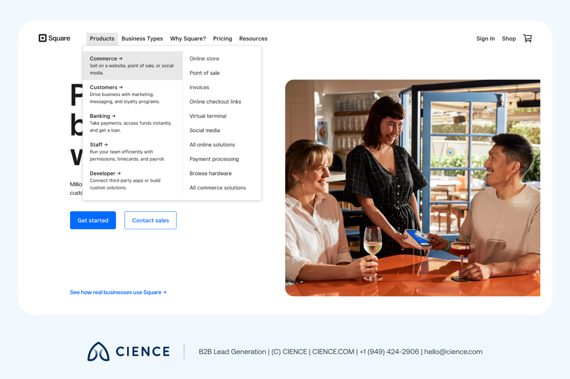
The overall layout is simple, featuring clean menus, limited but clear options, and small snippets of text. Logically organized categories allow visitors to easily navigate the different sections. These small but effective measures give users the feel of a personalized web experience that keeps them engaged and on the Square website for longer.
2. Asana: Well-placed CTAs
Including bold and clear CTAs is one of the most significant considerations in effective B2B website design. Asana’s home page is an excellent example of this, with multiple strategically placed call-to-action buttons that direct the audience to take the intended action.
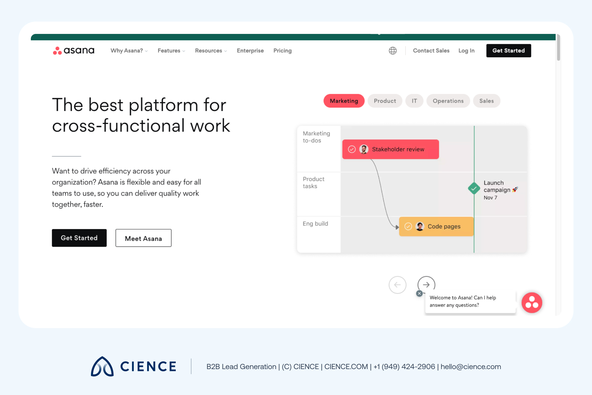
Asana positions its CTAs at the top right corner, the center of the home page, and near animations of the product in action. The clear design and unique selling point surrounding them entice users to click and convert as they scroll down the home page.
When creating CTAs for your website, one takeaway tip is to use as few words as possible while still effectively conveying your message. Asana sticks to two-word, tested phrases like “Get Started” and “View Demo.”
Also, remember to A/B test your CTA phrases, the button colors, and positioning to see which impacts your conversion rates most.
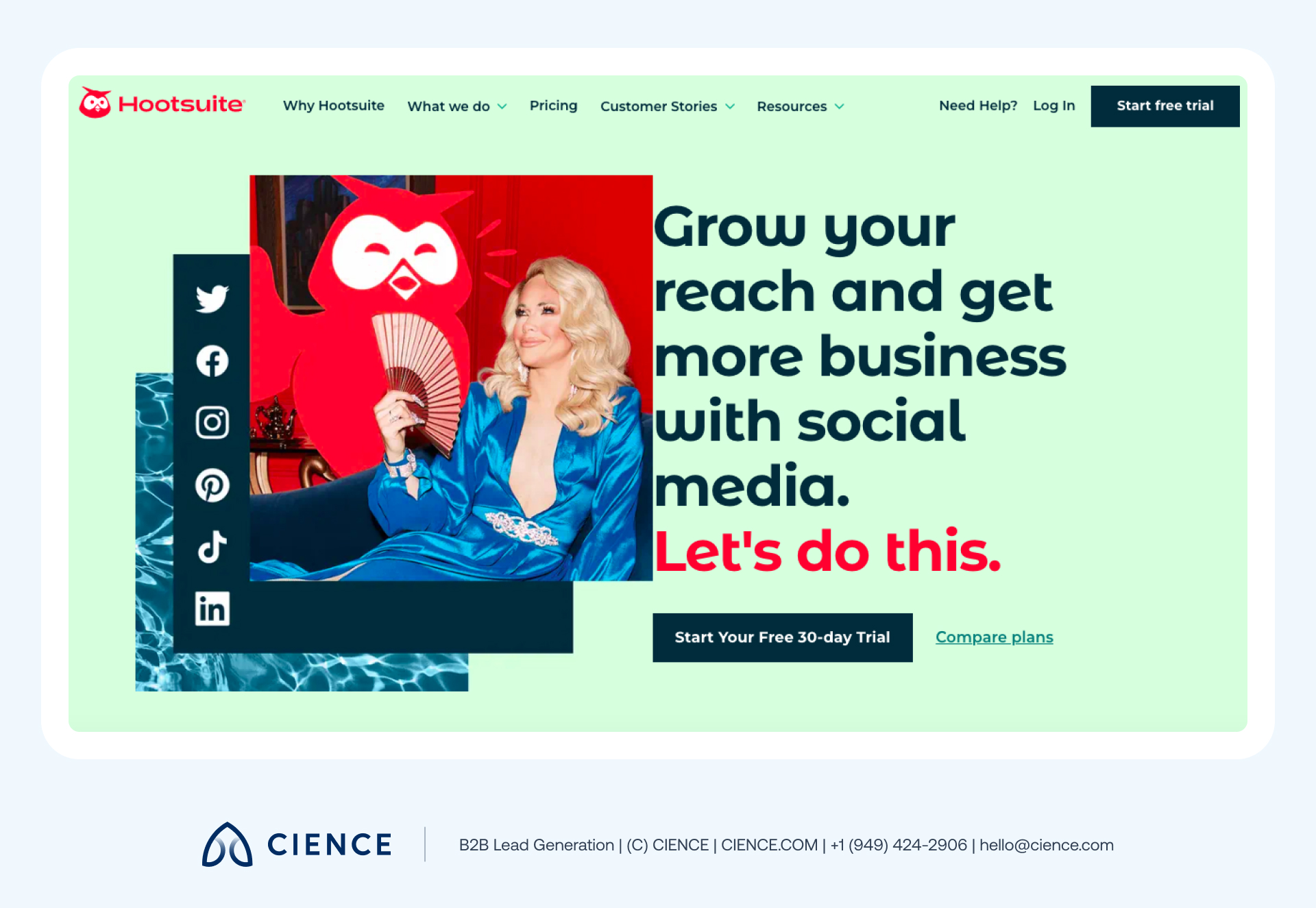
3. Hootsuite: Captivating design and imagery
Hootsuite’s website features a clean, modern design emphasizing the brand’s focus on social media management.
The use of bright colors and engaging graphics helps convey the brand’s benefits, while the site’s intuitive navigation makes it easy to explore. The captivating imagery of a lady fanning herself with social media icons by the corner tells you to relax as they help you get the best out of your social media channels.
4. Overpass: Impressionable and consistent branding
Branding consistency is key when it comes to increasing brand awareness, recognition, and recall across your website.
Look at Overpass’s website, for example. Their home page features a vibrant color scheme that solidifies their striking brand, while unique typography and generous use of white space draw attention to important copy and imagery.
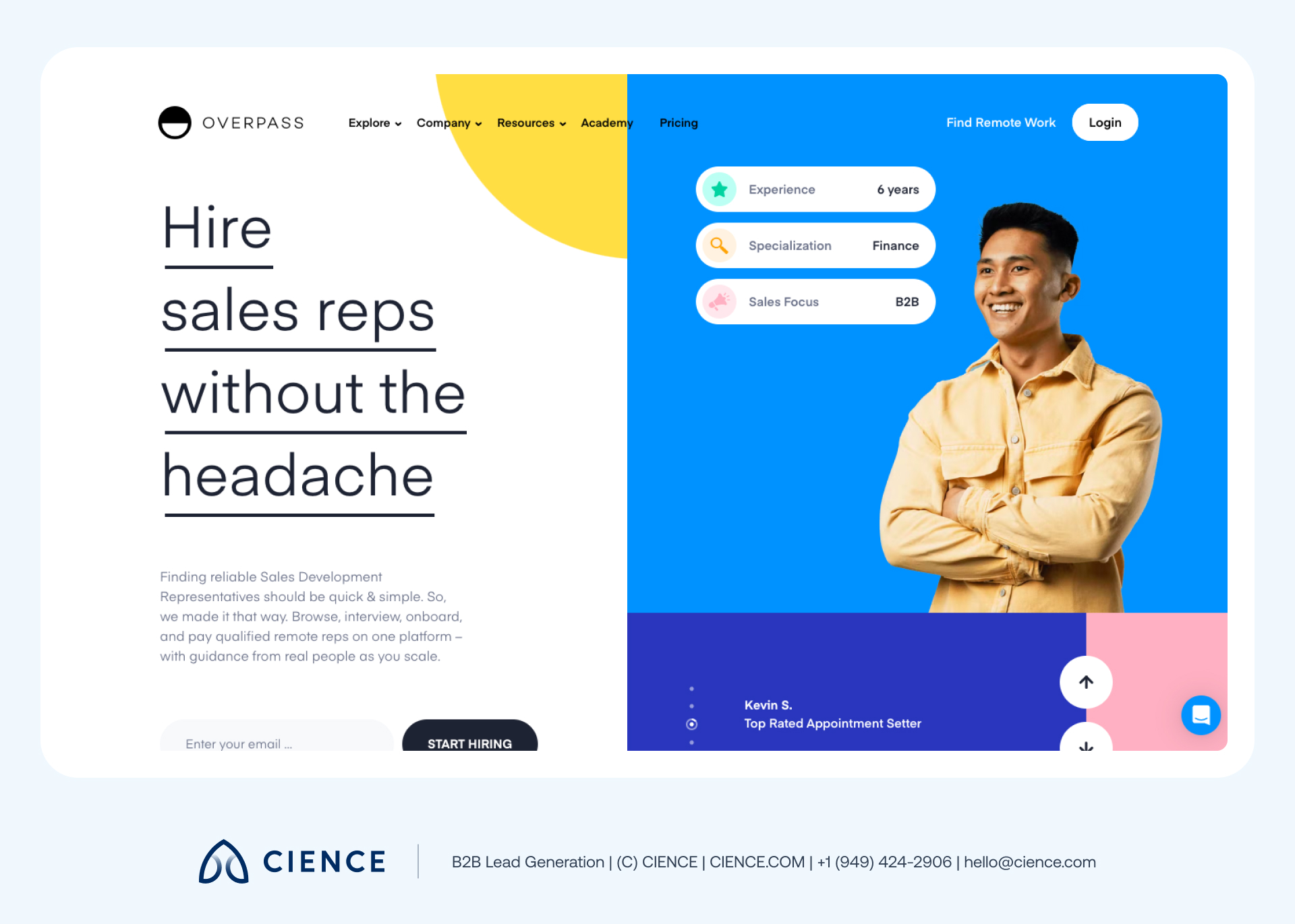
This consistency extends to other web pages, including the “Career” page and the company blog, creating a sense of uniformity and reassuring visitors they’re still on the Overpass website.
Investing in B2B web design that showcases your brand identity is a smart move for any business. After all, your brand identity is what differentiates you from competitors, and it can even increase your average revenue by an impressive 23%.
5. Vinebox: Minimalist design
Vinebox uses a refreshingly minimalist design to show visitors essential information upfront. It has just one line of copy and a prominent “Shop Now” CTA so users can easily grasp what’s being offered without confusion.
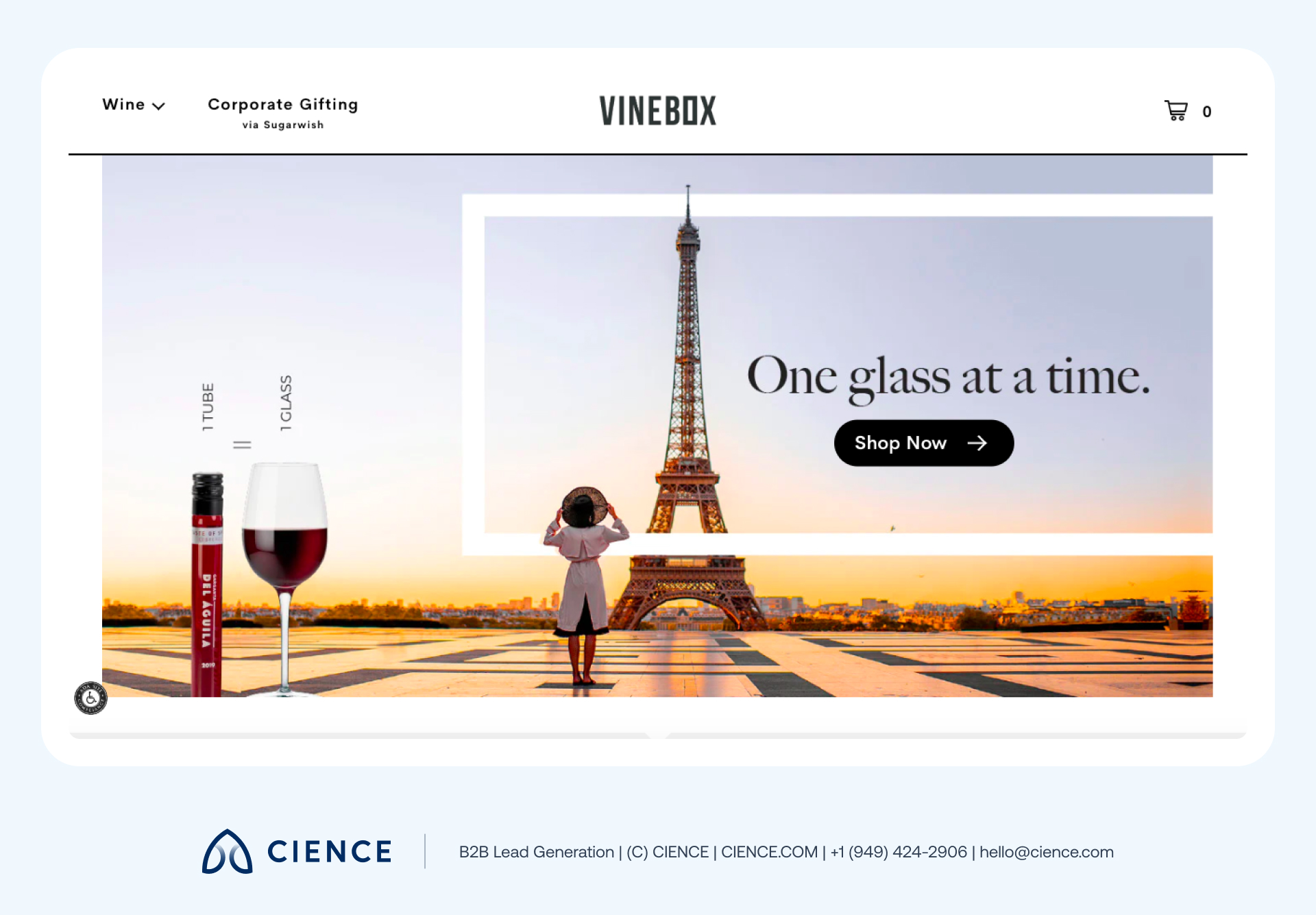
If you’re looking to create a successful B2B website, minimalist design is often the way to go. When emulating Vinebox’s approach, avoid overloading your visitors with too much information on the home page. Incorporate lots of white space and ensure every element you add serves a specific purpose. This will also reduce your load time and increase your visitor engagement.
If your website looks great but your pipeline is empty, design alone isn’t the problem—targeting is.
“Working with CIENCE created scalable, predictable pipeline—we generated 4,000+ qualified leads in just 4 months.” — August Ash
6. IBM: Responsive design
According to Statista, customers prefer shopping or looking up information on their mobile devices. So, it’s no surprise a responsive website ranks higher on search engines, attracts more traffic, and delivers a satisfying user experience.
IBM is one B2B company that has mastered the art of web design responsiveness. Here’s what the IBM website looks like on the desktop versus the mobile phone:
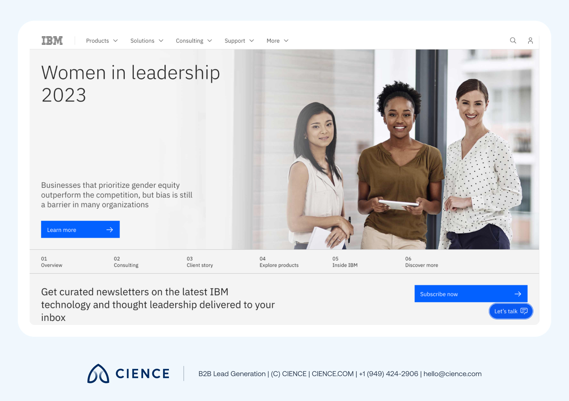
And what it looks like on a mobile phone:
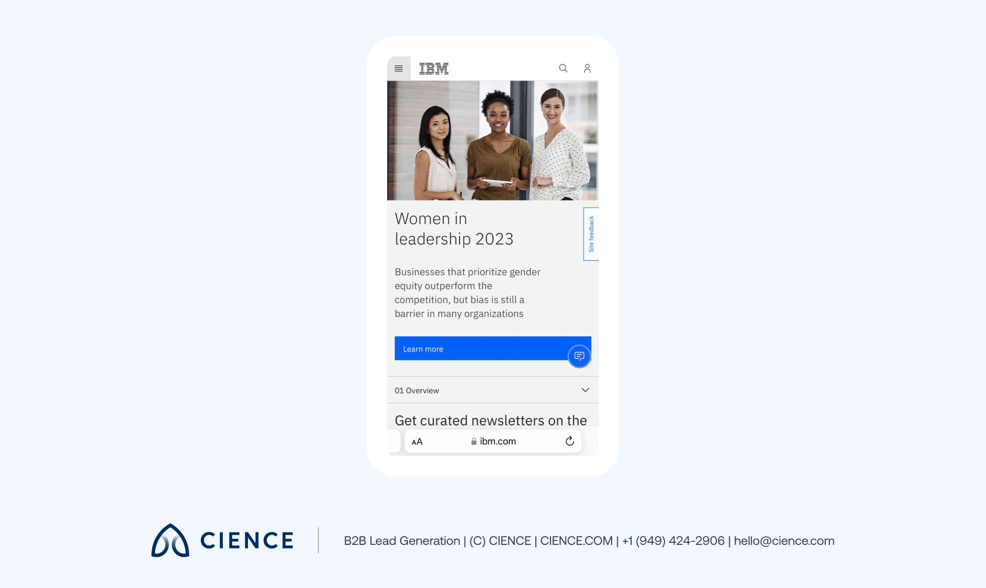
Alongside the consistent design, the web pages load quickly, and the navigation menu options are clear across devices. This makes it easy for users to navigate the site on different screens.
Nothing’s worse than a website that’s not optimized for small screens and takes ages to load. So, when designing your website, use a predesigned layout, set responsive breakpoints, and optimize for touchscreens to provide a seamless experience for your users.
7. Dropbox: Social proof
B2B websites can greatly benefit from social proof, which refers to evidence that others have used and appreciated a product or service. Think about it—how often have you dined at a restaurant based on a friend’s recommendation or a positive customer review?
This same idea applies to B2B websites. Prospective customers want to know how they will receive value from your offering and want other customers to back your claims.
Dropbox showcases testimonials on its home page, authenticating them with the reviewer’s name, photo, company name, and position. What’s more, the featured individuals are meticulously selected to each represent the target audience Dropbox is trying to reach.
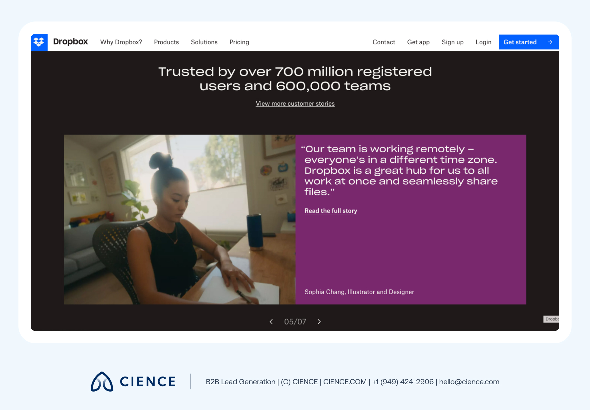
You can add various types of social proof to your website, including reviews, case studies, testimonials, expert opinions, and awards or trusted badges. If you have customers who are already benefiting from your services, feature actual quotes from them—complete with relevant details—to lend credibility and generate more inbound leads.
8. Riello Sistemi: Captivating videography
Video isn’t new, but it has become increasingly effective at showcasing a brand and its offerings in the current era of short-form content than written content alone. This makes it a valuable addition to landing pages.
Riello Sistemi’s captivating home page videography effectively draws your attention to the content, showcasing its potential value and demonstrating expertise to set them apart from other industrial equipment suppliers.
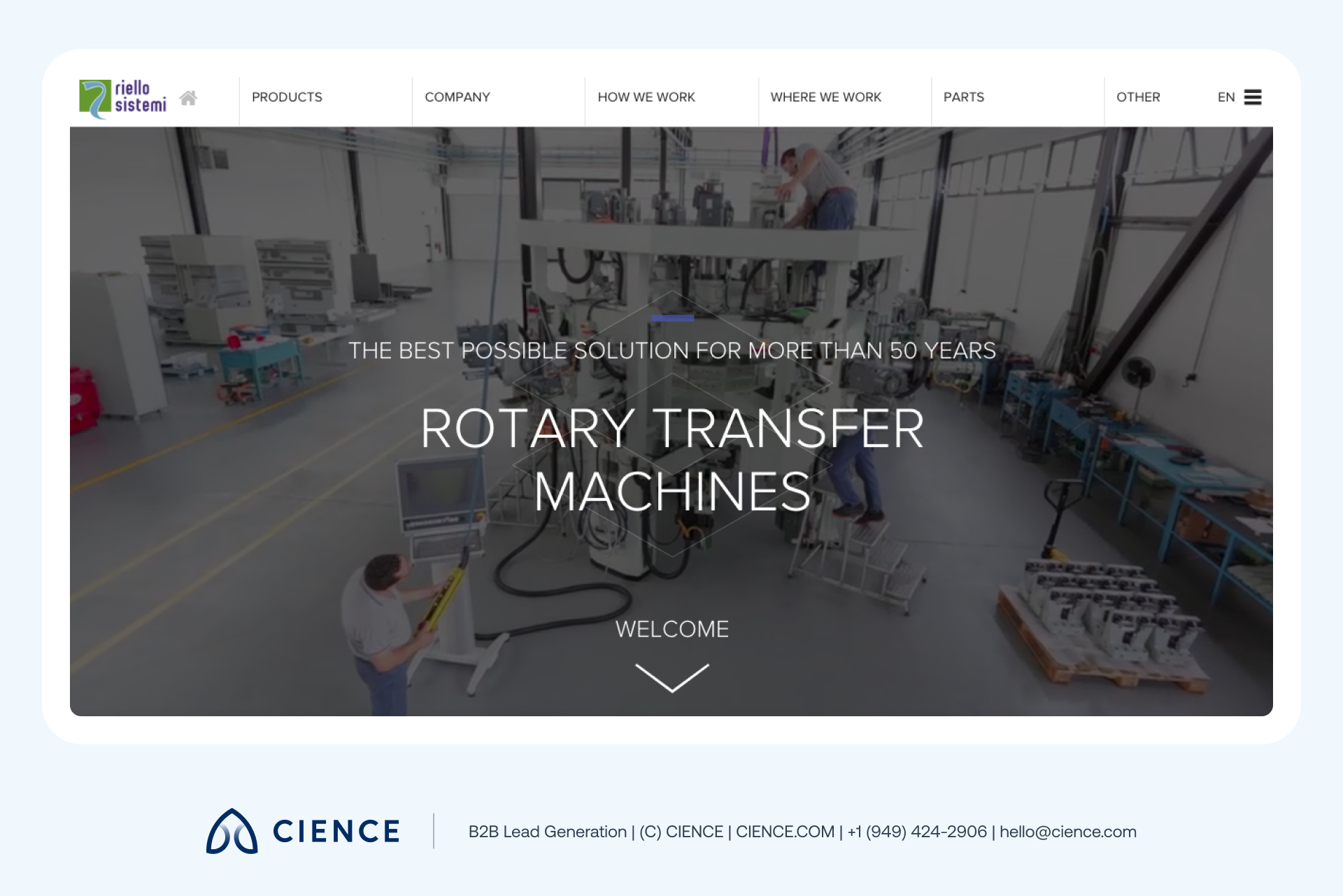
When creating a video for your B2B website, make sure it serves a clear purpose and provides depth to your offerings. It should also highlight your business’s unique selling points and reinforce your brand message to positively impact user engagement and conversions.
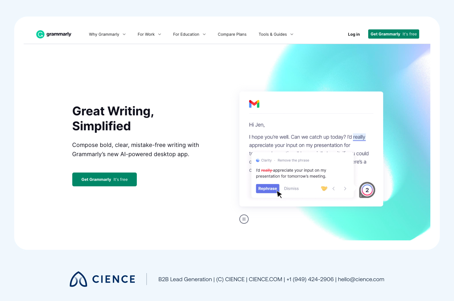
9. Grammarly: Clear value proposition
Within a few seconds of browsing your home page, your visitors should have a clear picture of what your business’s value proposition is and what makes your offering unique. This will help you attract and retain potential customers, setting the stage for successful B2B customer relationships.
Take Grammarly, for example. The concise but impactful headline copy on its home page provides just enough detail to convey how Grammarly can help with your writing needs. Then, using attention-grabbing animations, the company effectively showcases its product in action and highlights the advantages it offers over traditional writing tools.
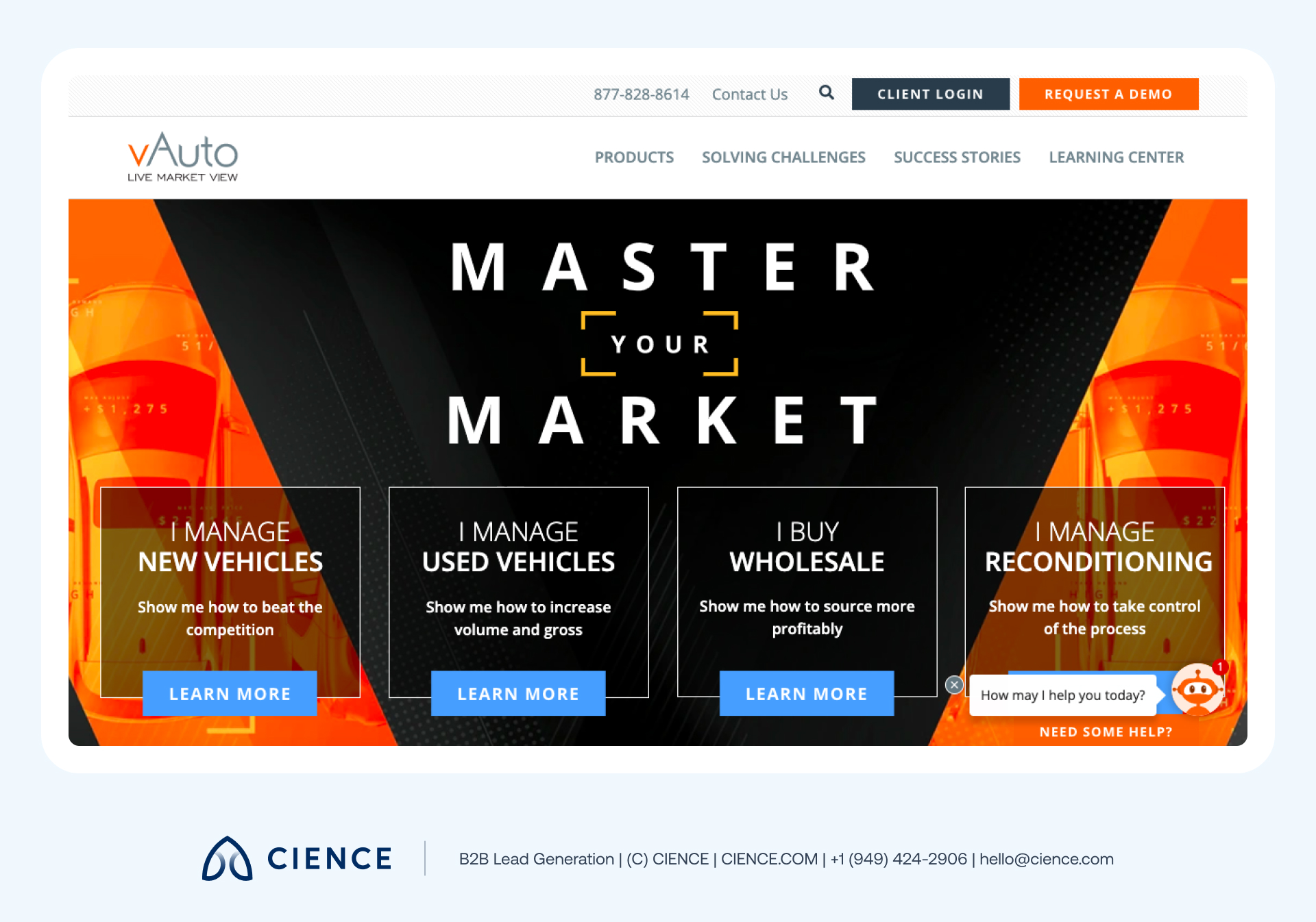
10. vAuto: Quality content
Your B2B website should emphasize your customers’ outcomes and how you can help them accomplish their goals. You can achieve this through quality content that addresses specific pain points and provides informative and educational resources.
As part of its web design, vAuto uses small, well-written text paragraphs on its home page to enable users to self-identify according to their specific needs and interests. The website is designed to simplify online learning and buying as much as possible, with a clear breadcrumb trail leading directly to vAuto’s unique offerings.
Another important aspect of quality content is ensuring it’s optimized following SEO best practices. With 40% of consumers saying they research a purchase using Google, it’s no surprise that improving SEO is the number one priority for most B2B marketers.
This makes sense as SEO can improve your B2B website’s Google rankings, increasing its visibility among potential customers searching for your specific product or service. After all, the best B2B website designs keep the customer and Google in mind.
“The CIENCE team’s data-driven approach delivered a 10% conversion rate across 150 qualified companies—a result we couldn’t achieve internally.” — Turn Technologies
CIENCE + graph8 pricing: $5,000 one-time GTM system setup, $2,499/mo strategic execution, and the graph8 platform at $499/mo. No long-term contracts. See full pricing →
Whether or not you decide to work with us, you’ll walk away with a clear picture of where your pipeline is leaking and what it would take to fix it.
Frequently Asked Questions
How much does a B2B website redesign cost?
A B2B website redesign typically costs $15,000-$100,000+ depending on complexity, number of pages, and custom functionality. Simple template-based redesigns start around $5,000-$15,000, while enterprise sites with custom CRM integrations, complex navigation, and interactive features can exceed $100,000. Budget 15-20% of the initial cost annually for ongoing maintenance and optimization.
What are the most important elements of B2B website design?
The 5 most critical elements are clear navigation (88% of users never return after a bad experience), strategic CTA placement, mobile responsiveness, fast page load speed under 3 seconds, and social proof like testimonials and case studies. Consistent branding across all pages can increase revenue by 23%, making visual consistency equally important.
How often should a B2B website be redesigned?
Most B2B websites benefit from a full redesign every 2-3 years to keep up with design trends, technology changes, and evolving user expectations. However, continuous optimization through A/B testing, content updates, and performance improvements should happen monthly. Track metrics like bounce rate, time on page, and conversion rate to determine when a redesign is truly needed versus incremental updates.
Create a Winning B2B Website Design
As you redesign your B2B website, consider incorporating some of the examples above to create an engaging and effective website for your business. If you’re not sure where to start, consider using built-in web design templates to efficiently create a high-quality website that incorporates these best practices. Either way, in the end, you’ll have a strong B2B website design that not only looks good but also drives business growth.
Ultimately, the key to creating a top B2B website design is to stay up-to-date with the latest trends and best practices, while also ensuring that the site is tailored to the specific needs and preferences of your target audience. With the right approach, it’s possible to create a website that not only looks great but also delivers real results for your business and customers. Rated 4.6/5 on Capterra by 250+ reviewers, CIENCE has helped companies across 250+ industries turn their pipeline strategy into a predictable revenue system.
A graph8 company — AI-powered GTM execution across 250+ B2B industries.
graph8 Platform
From $499/mo
Run your own GTM campaigns with AI-powered data, sequences, and analytics.
Start Free — 2,500 Credits No credit card requiredCIENCE Managed
From $2,499/mo
Our GTM teams build and run your outbound campaigns end-to-end.
15-min call · No commitment2,500+ B2B companies served · Month-to-month contracts · See full pricing →